Non-Profit, Education, and Racial Equity
A Collection of Projects that Promote Racial Equity in Government, Education, and Policy
Clients: Scholastic, Greater Cincinnati Foundation, and StriveTogether
Adobe Suite: InDesign, Illustrator, and Photoshop
Independent Freelance Projects
Print Design, Brochures, Racial Equity & Justice, Data Visualization, Art Direction, Asset-Framing
I have worked with many organizations locally and nationally on projects focused on racial justice and equity including: Scholastic, Crossroads UnDivided, The Greater Cincinnati Foundation, StriveTogether, and Praxis Matters. My contributions to these organizations include creative on print and digital projects, racial conversation facilitation, and work as a student/entrepreneur (TAPO) to bring about social change.
Scholastic:The Four Pillars Classroom Library
Challenge
Scholastic wanted a hand-drawn kids theme for their new classroom library called “Super Readers” and a printed brochure to promote and amplify the library collection. The brochure had to adhere. to Scholastic branding including brand marks, typography, colors, both professional photography and stock photography. The theme had to be versatile and scalable for additional deliverables and promotional materials.
Results
The original collection was called “Super Readers;” however after seeing my pillars sketch, they renamed the collection to “Four Pillars.” The artwork resembles kids’ doodles and sketches for a fun and unique theme. The digital artwork was hand drawn on paper, and then traced in Illustrator. This particular brochure was for schools in Texas and the Texas state shape gave a sense of place. In many areas of the brochure, photographs were combined with illustrations giving a mixed media vibe. The theme was used for sales sheets, social media, email and digital graphics on the website.


Scholastic: Yale Study Center and Scholastic Collaborative Logo
Challenge
The Yale Study Center and Scholastic Collaborative arose from a shared commitment to exploring how literacy can be used to foster resilience among children and families. They believe in a multi-generational approach to literacy that is grounded in storytelling, social connections, and place-based learning to strengthen communities. The collaboration needed a logo that communicated their approach and their commitment to foster resilience through literacy.
Logo Concepts:

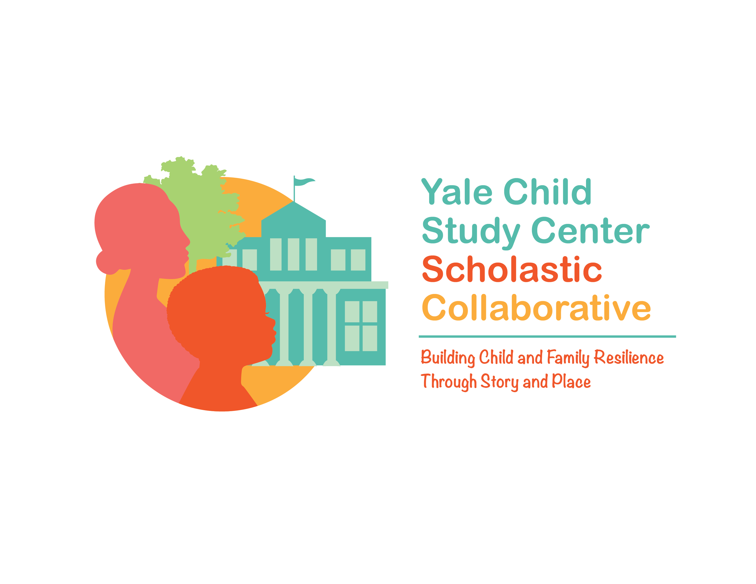
Results: Third Logo Concept
The Yale Study Center and Scholastic Collaborative logo was designed to uplift the stories of marginalized communities and show the richness of community and place. The colors used bring about a sense of warmth, history and community. The logo features a child prominent in the foreground surrounded by the people and places that are a part of his world and essential to grow resiliency and success. The woman in this picture could be his mother, his grandmother, someone in his community or an educator. The building represents a school or other prominent building in his community. The tree represents a supporting element for community.
Ultimately, Yale chose none of the logos that were created by any of the team of designers. They went with a very safe (and boring) logo that had no sense of story or place. However, I enjoyed the process of designing a logo for a cause that I felt very passionate about. Looking back, it was the first project where I was able to combine my design skills and passion for improving outcomes for people of color and pushed me to do work in racial justice.
Logo Color Variations


Scholastic: LitCamp Impact Infographics
Challenge
Scholastic wanted to combine both testimonials and statistics from independent school programs in different states to show the success and impact of the LitCamp literacy program.
Results
I designed an engaging one page infographic using stylized infographics, color, and texture to make Scholastic LitCamp come alive and tell the story of its impact .

StriveTogether Case Study- HB3 Texas
Challenge
To create a case study that had intriguing imagery, clearly communicated data visuals, and tells the story of policy change in Austin, TX. StriveTogether’s partners share this information to inspire and inform others with the hopes of replicating similar results in other cities and states.
Results
Data-driven content and infographics were essential to inform and motivate. There is a sense of place evoking the feel of Texas throughout the case study with the Texas State infographic, the photography of The Capital and the people that live in Austin, TX. The case study is easy to read because of its’ visual and consistent hierarchy and follows StriveTogether’s branding with color blocking and quote callouts. StriveTogether’s partners and investors were thrilled with the case story.


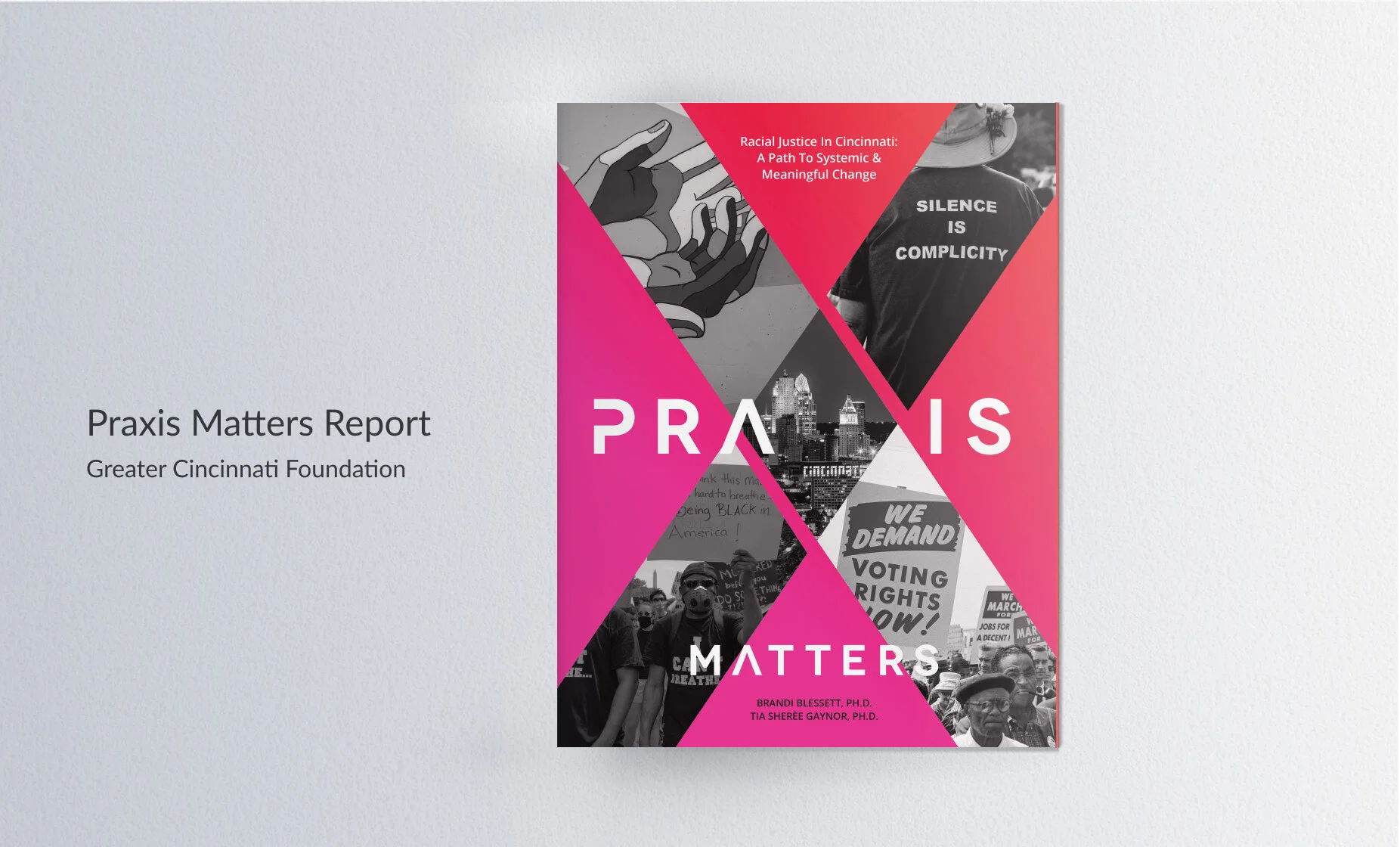
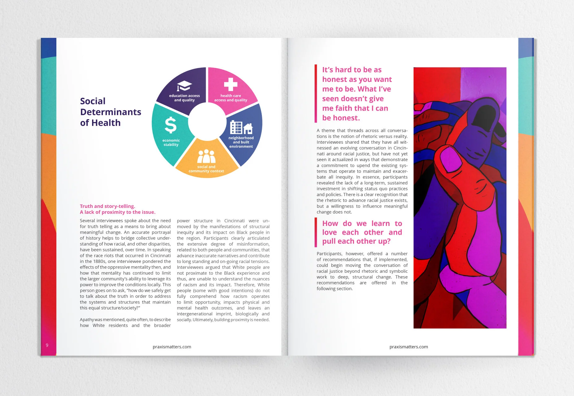
Praxis Matters Report
Challenge
Praxis Matters needed a professional report to share with the Greater Cincinnati Foundation that showcased their findings from their research. Praxis Matters had a logo, but did not have established branding assets that could be used for print design. I created a brand look and feel that was an extension of the logo.
Result
The result was a thought-provoking report that combined powerful imagery, quotes, and color to inspire the audience to to create systemic and meaningful change.