
Building a website: Kroger Data & Analytics
Strategy, research, leadership, influence, solutions, collaboration, visual design
Client: Kroger product teams
Role: Senior product designer
Worked collaboratively with product manager, software engineers, analysts and users (product teams)
Key skills, tools & methods
Soft skills
Leadership
Influence
Negotiation
Communication
Collaboration
Gaining trust
Stakeholder management
Mural / Userzoom
Discovery
Workshop facilitation
Interview, analysis & affinity mapping
Quantitive & qualitative research
Process flows
Card sorting
Wireframing
Tree testing
Usability testing
Information Architecture
Figma
Wireframes
Mockups
Interactive prototypes
Visual design
Presentations
Data Visualizations

Kroger Data & Analytics website overview
Part 1- Impact
100% of teams transitioned to new process
Reduced time of process to receive data analytics from 86 to 11 days
MVP portal launched
Research & personas was complete to inform future improvements
Part 1- Challenge: Make analytics tagging easy
Create analytics processes (tag/ bugs/ reporting) for Kroger. Create documentation & intake for these processes
Simplify the process = improve speed to usability
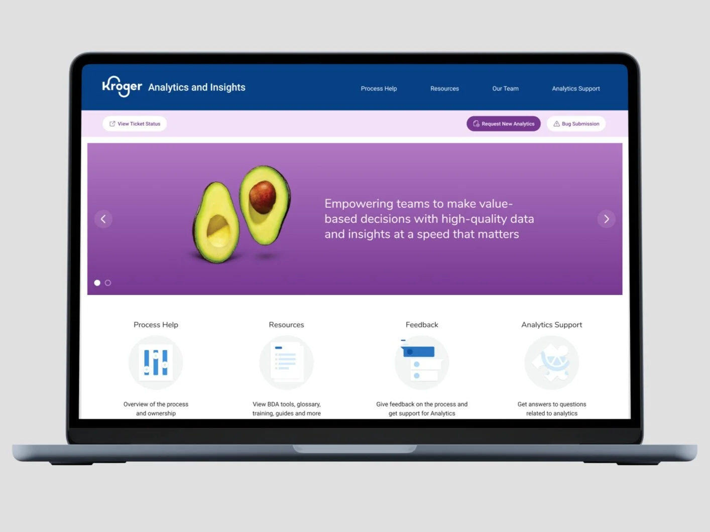
Create a MVP portal for Behavioral Data & Analytics (BDA)
Interview users to create personas & understand needs / painpoints
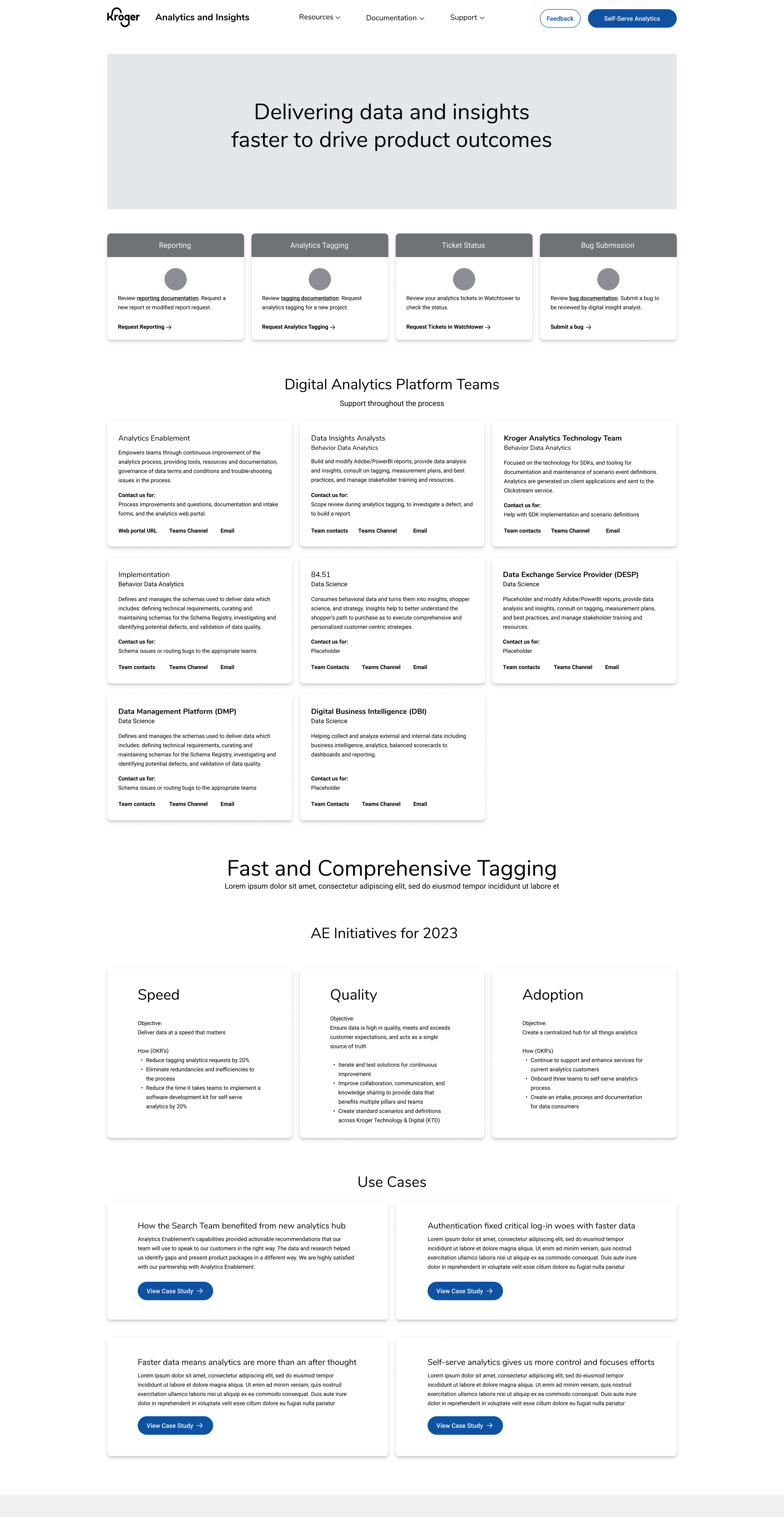
Part 2 - Challenge: Expand scope & improve central hub
Expand the portal to include all DAAP teams & services
Interview expanded teams to understand services & processes. Communicate what they do, give access to documentation & contacts
Improve usability & aesthetics beyond MVP
Create mega-menu for navigation, validate & test
Move towards customization & personalization
Increase feedback from customers
Part 2 - Impact
All DAAP teams & services included in the portal including services, description, documentation, and contact info
Improved usability & look of portal (testing of improved usability)
Mega-menu gives access to all DAAP team services
Increase of feedback from modals (in-progress)
Creation of registration form & my data tools for customized experience for quick access to most used tools by customer
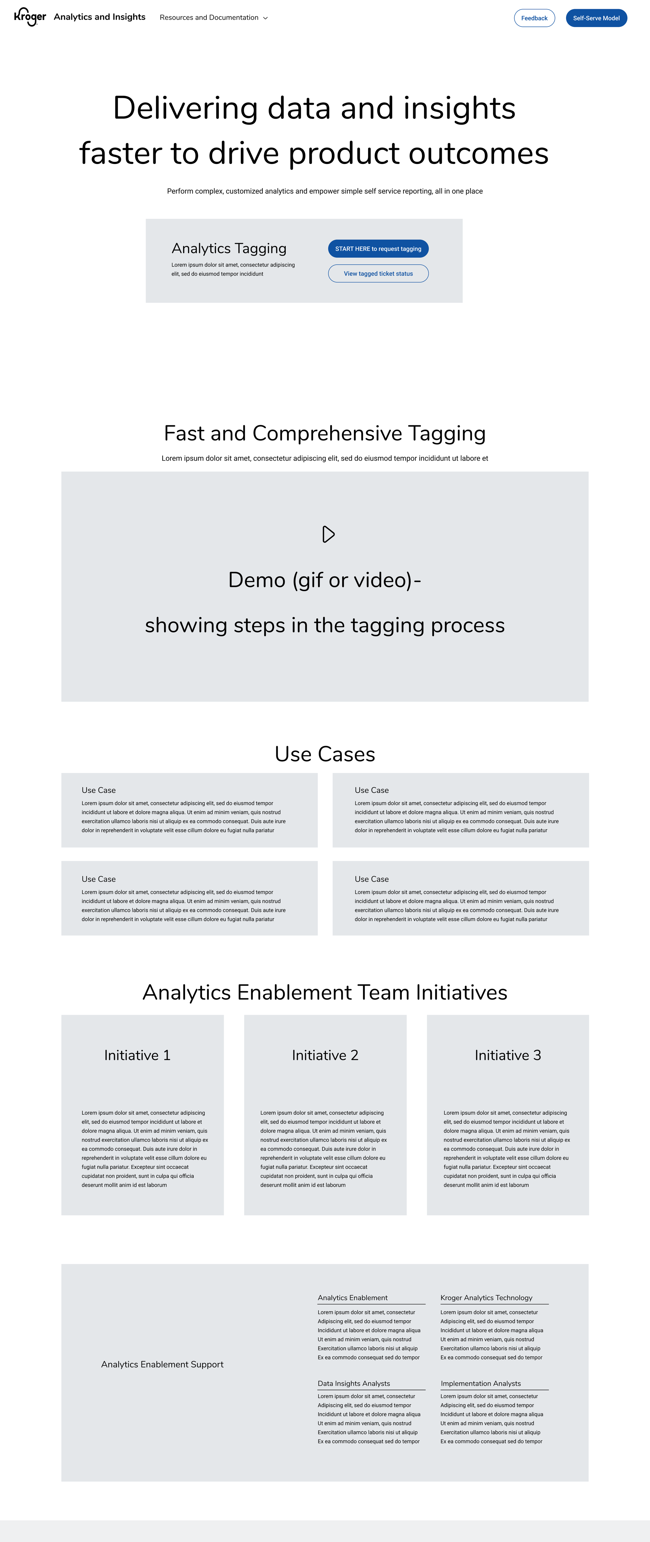
Part 1 - Make analytics tagging easy
Where Behavioral Data & Analytics (BDA) Started
BACKGROUND
Previous documentation was located on internal confluence pages making it hard to find
Request form was a word document that was copied & pasted in an email
CHALLENGE / THE WHY
When I was brought onto the team, there wasn’t time for research / discovery. We started with an MVP to get users access to fundamental services. Post MVP we used continuous discovery, research and testing to understand our users and become more user centric.
Stop the bleeding. Break things & learn from the results
Quick MVP focused on highlighting new requests forms & documentation
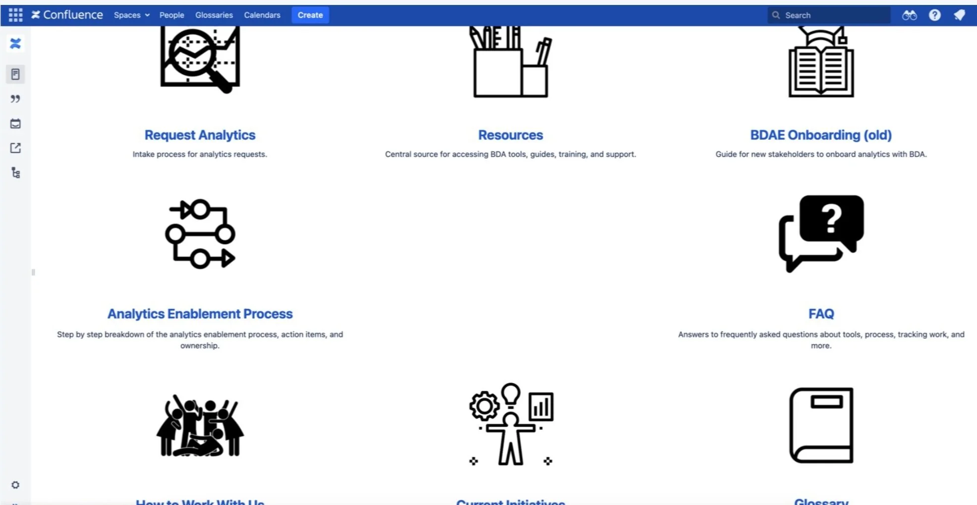
Behavioral Data & Analytics Confluence page. (Created before I was on the team)
Quick & dirty MVP that linked to the documentation & requests for analytics tagging
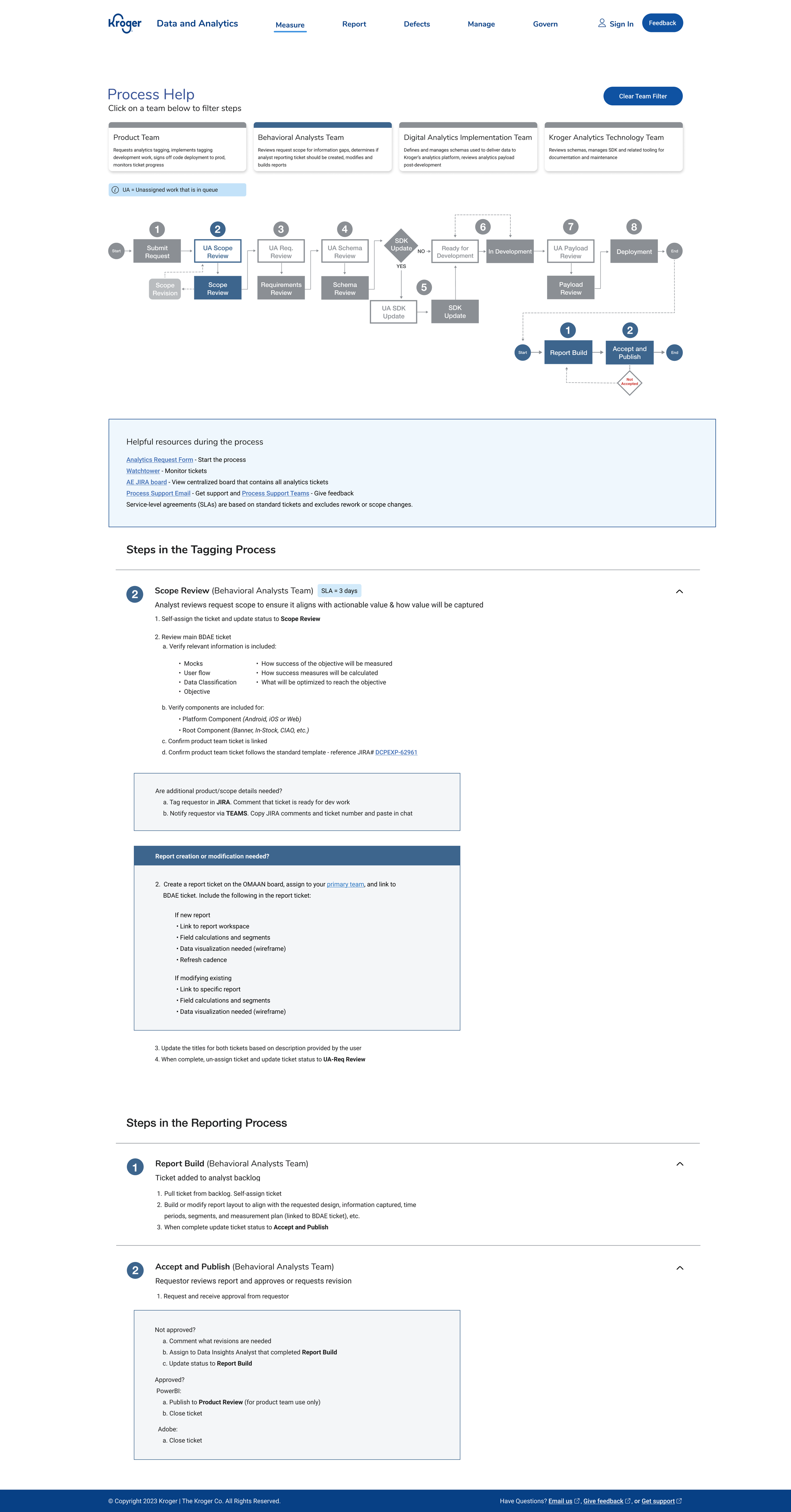
Create Official Documentation & Request for Analytics Tagging
HOW
Wireframes & multiple workshops
Interactive filter shows steps by teams and their processes
Flow diagram gives an overview of the process
Step-by-step instructions are numbered and categorized by team
————————————————————————————-
Collaboration with analysts & PM to create form fields & example language
UX writing for CTA, tooltips, flow and errors
Used Kroger design system components
Accessibility (grouping common fields / using labels / helpful errors etc.)
WHO
Documentation & request forms were created and documented by product team (analysts, PM, and myself).
WHY / CHALLENGE
Formalize process. Keep users and stakeholders close to the process
Create accountability, ownership & governance
Create a way for product teams to ask for support
Gather objectives, goals and metrics from requests to ensure valuable data
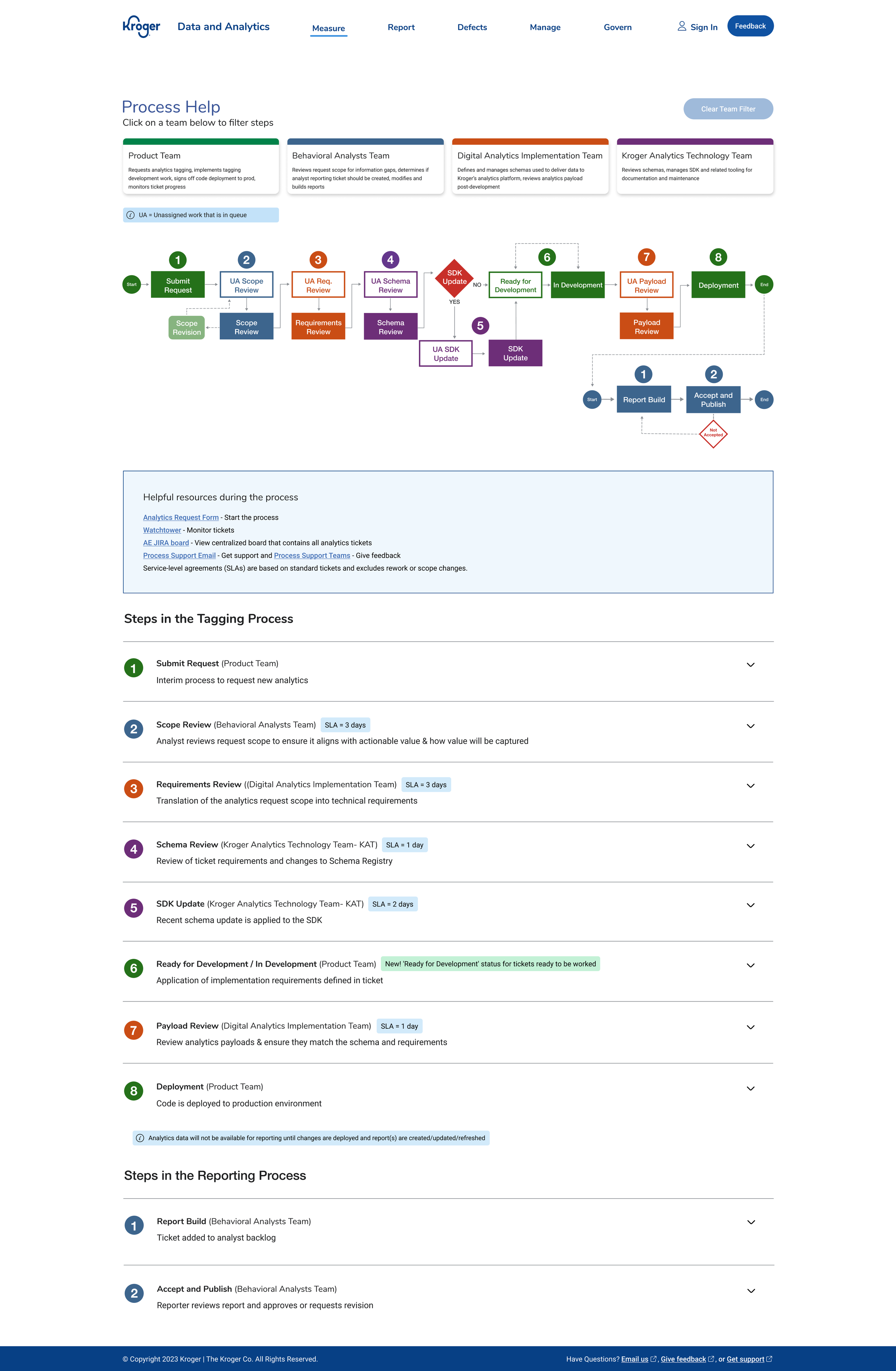
Analytics Tagging Documentation
Documentation filtered by “behavioral analyst” team
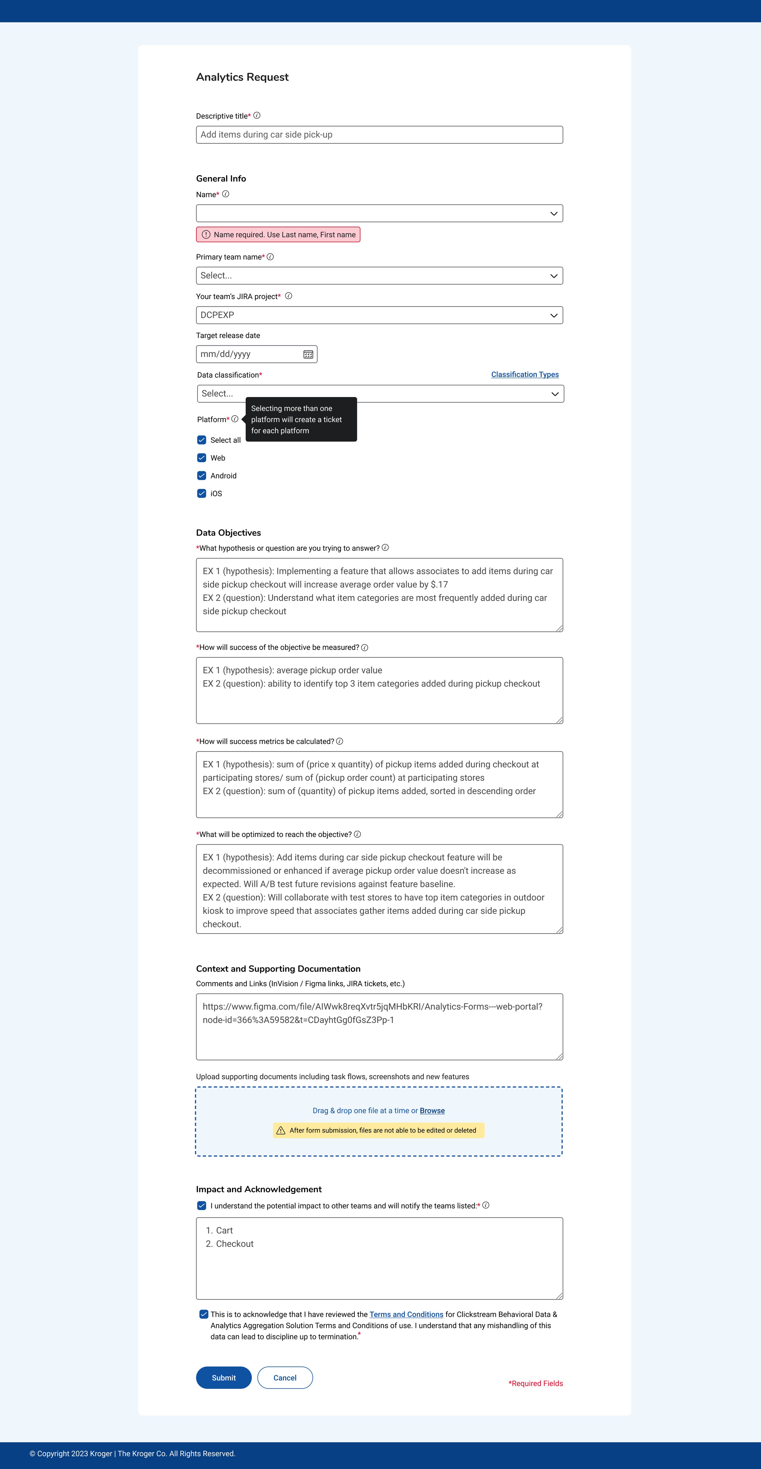
Analytics Tagging Request Form
Card Sorting / Ranking
Towards a more user centric information architecture
HOW
Userzoom unmoderated card sort
14 participants
14 cards to sort between 4 categories
1 comment question: What topics / categories would be beneficial to add?
WHY
How Might services / tools be categorized for improved findability
How Might We balance our current analytics tagging customers vs our new self-serve in terms of hierarchy and importance?
What AE features and services are most important to our customers?
What topics / categories are we missing?
Card Sort Findings

IMPACT- 3 ways it was beneficial
Card sorting / ranking informed our site architecture
Broken down by role, tool importance was used on personas
Qualitative Data was the start of "teams cards" on landing page
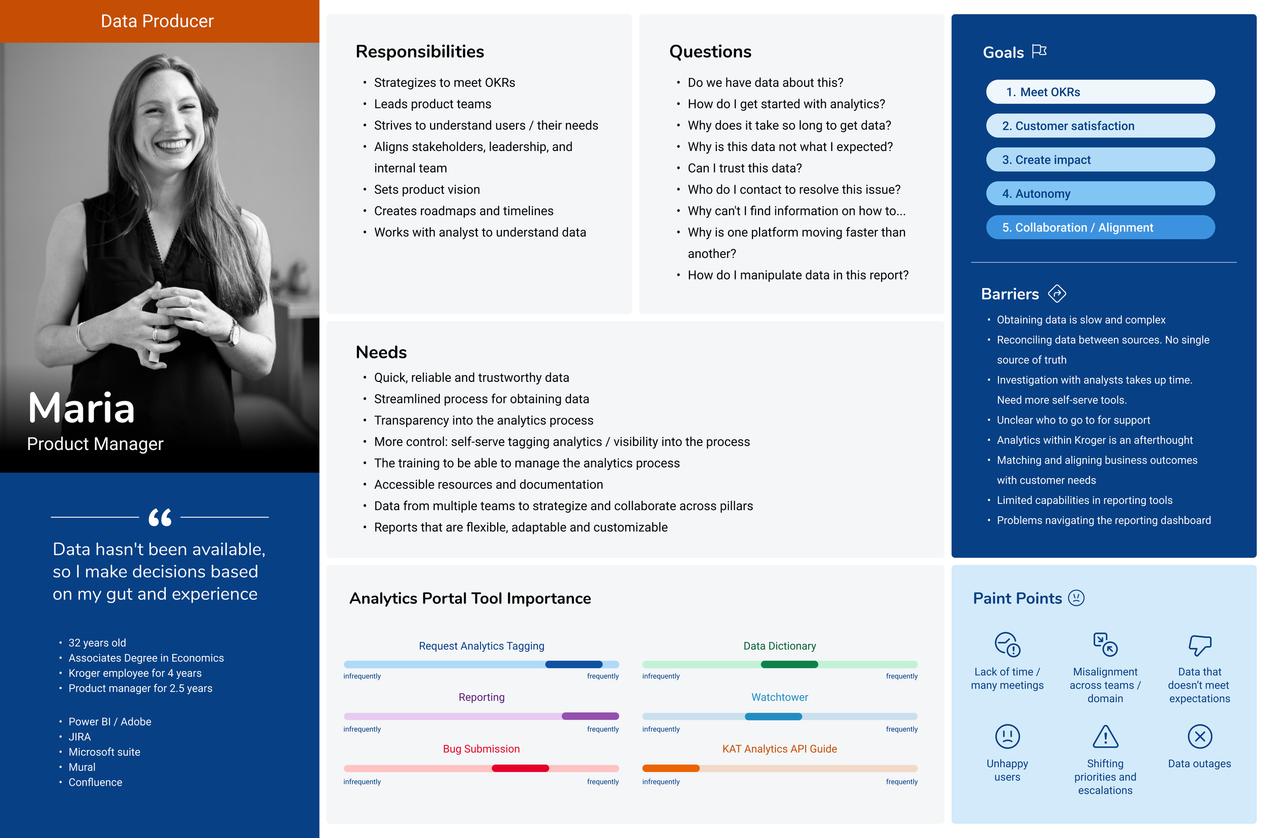
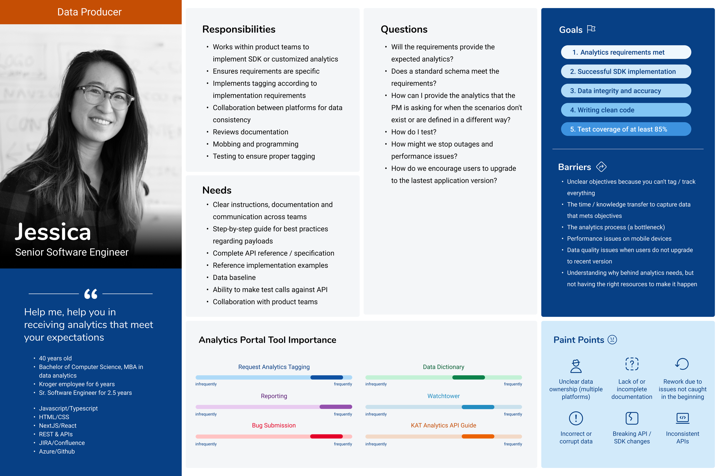
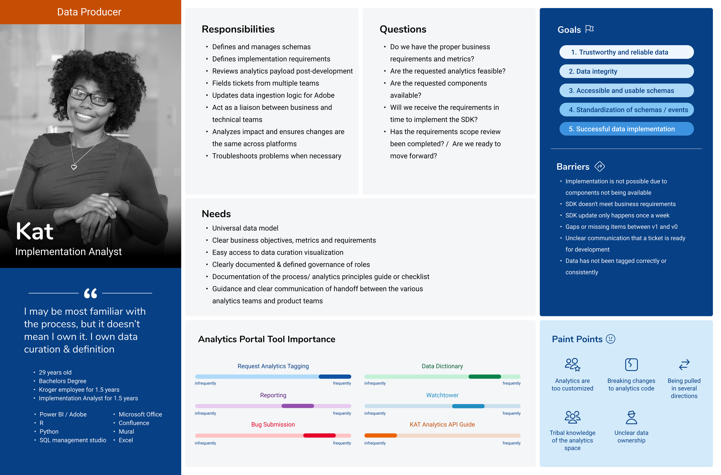
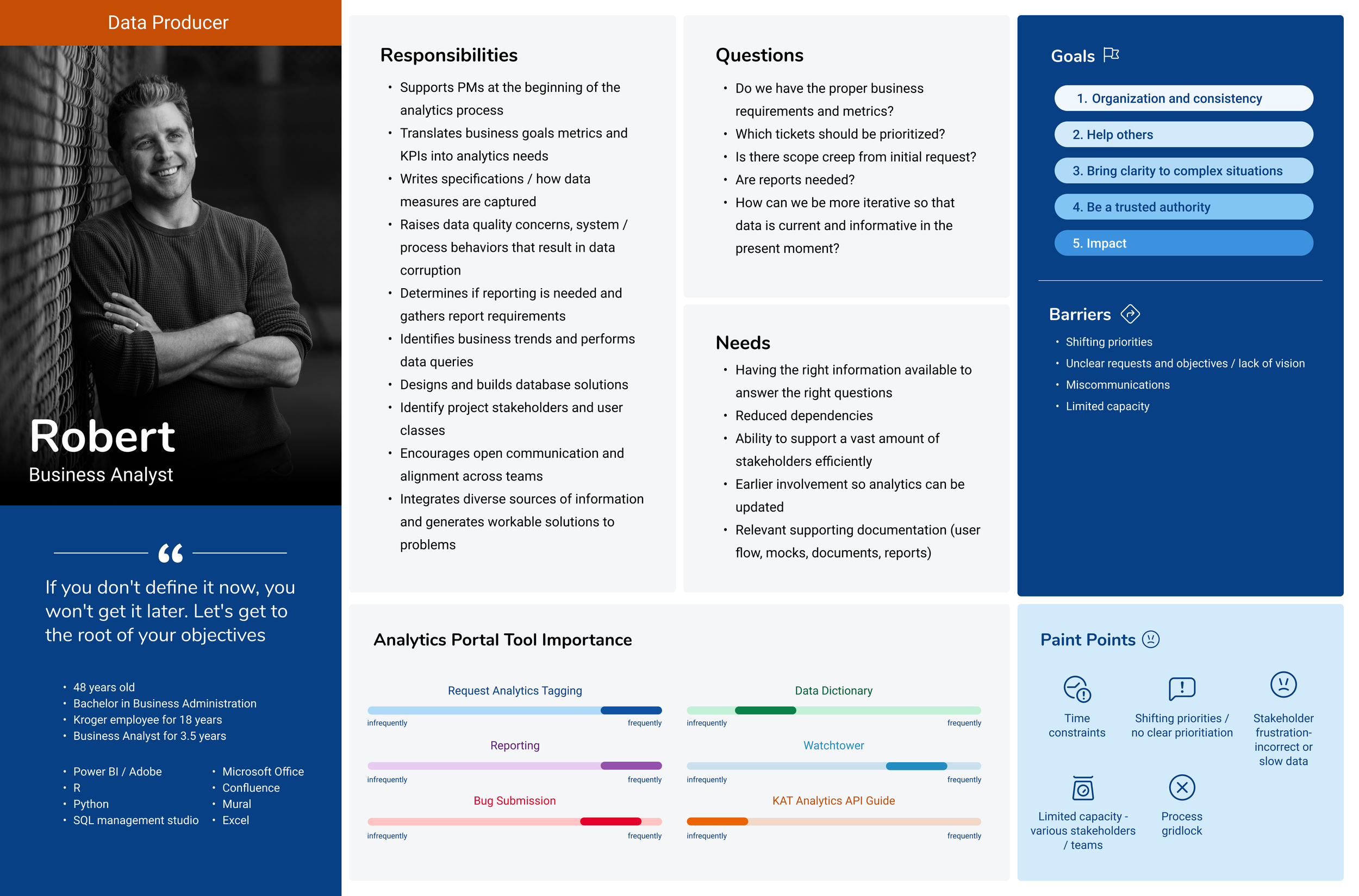
Analytics Interviews & Proto-Personas
A step towards a more user centric information architecture
HOW
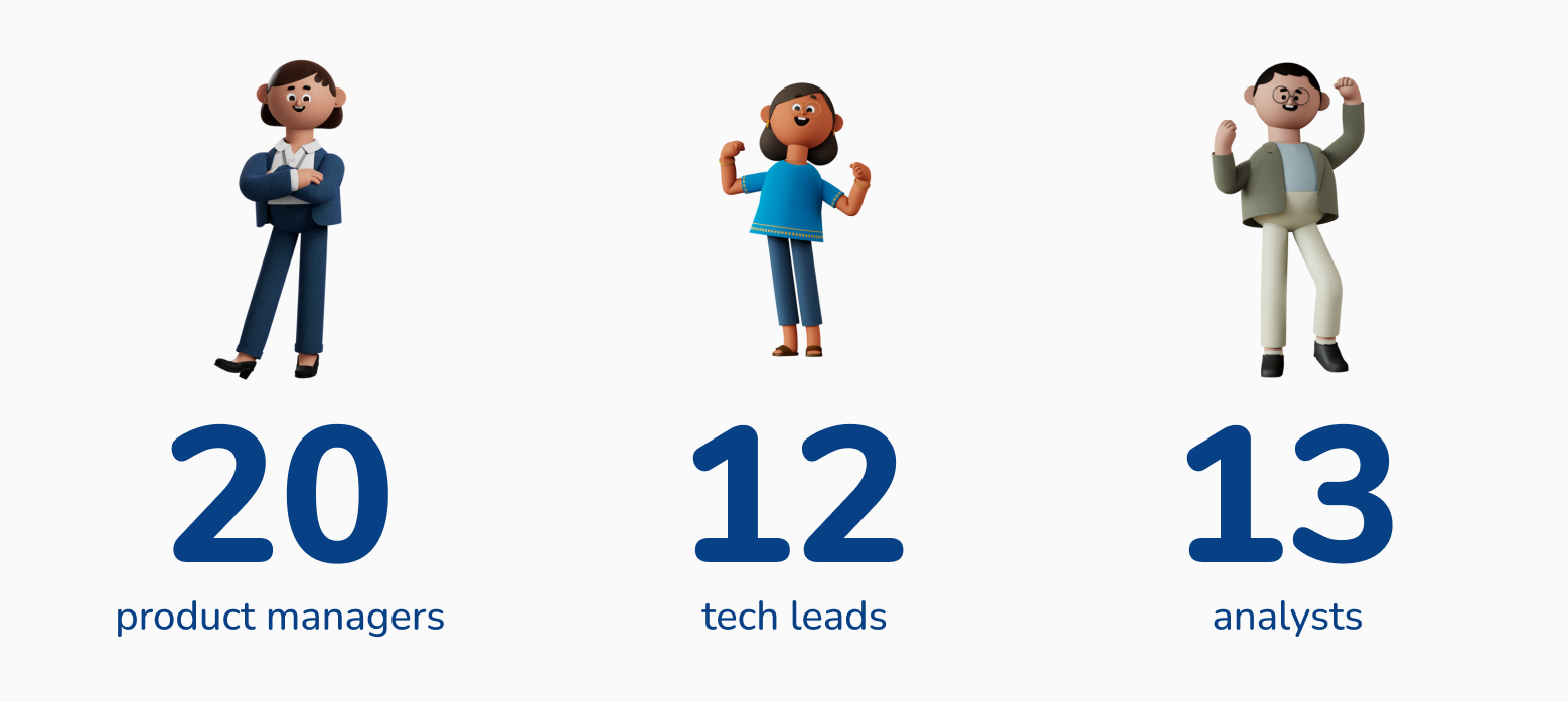
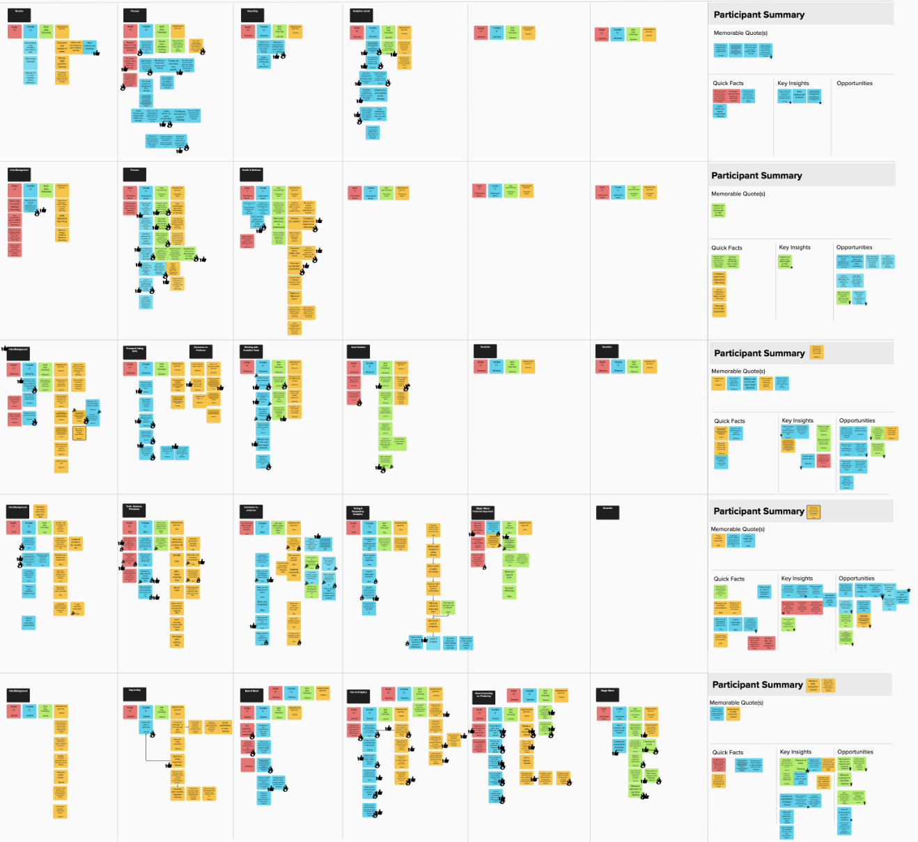
Data captured through 1:1 moderated interviews & card sorting
Partnered with Design Research throughout
Bud, rose & thorn stickies
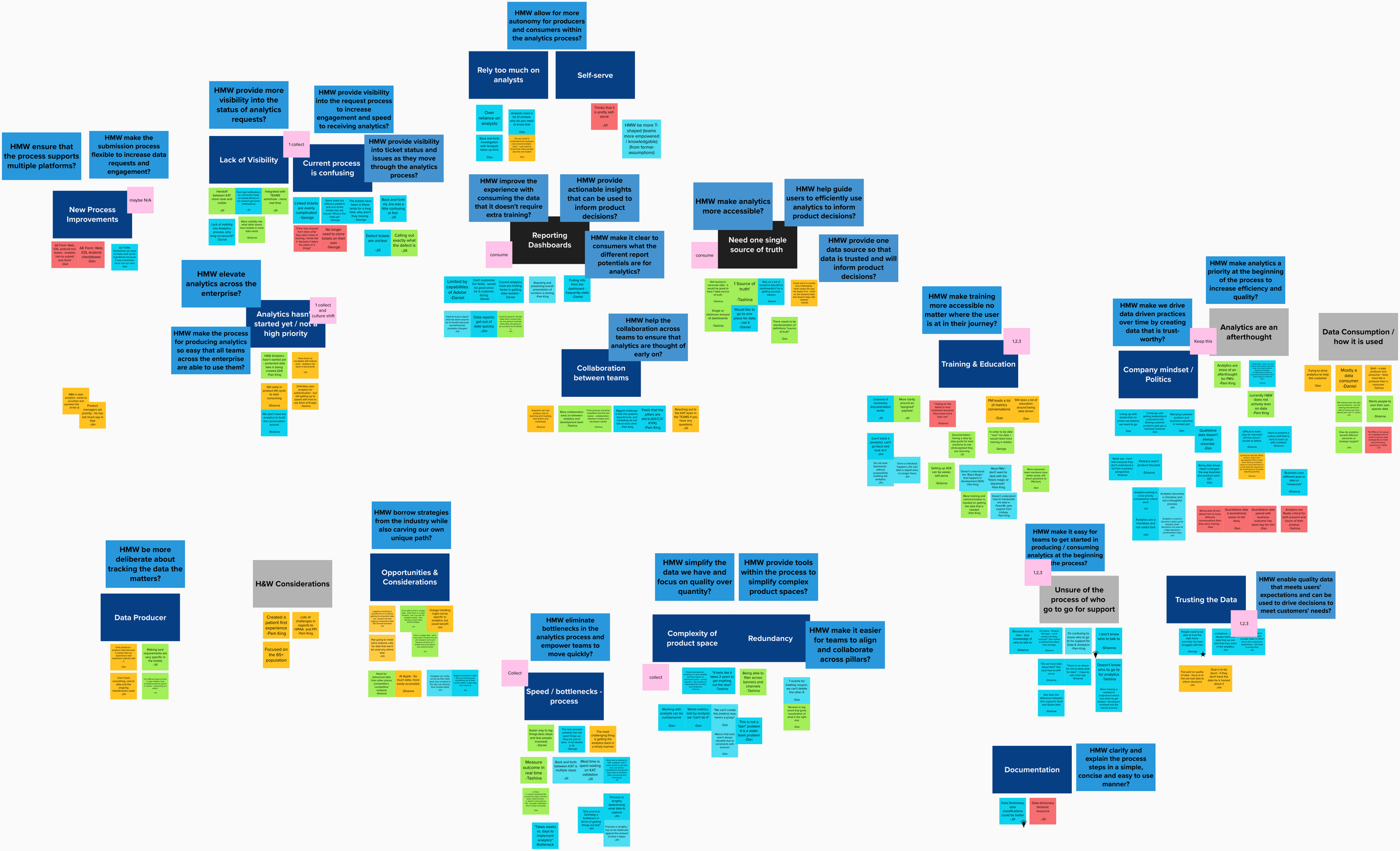
Affinity mapping session to analyze results, write ‘How Might We’ questions and uncover themes
Created 4 proto-personas that capture BDA audience
WHY
To understand our users (PM’s, analysts, developers)
To develop proto-personas
To understand processes and issues
To understand analytics teams and their services
Behavior Analytics Proto-Personas
IMPACT
The creation of proto-personas* allowed the team to have a collective frame to look through when thinking of opportunities (needs, pain points & challenges). Specifically, what are their needs, their goals and pain points so that we can try and address them
*Called proto-personas because of the number of the number of interviews & the need to continuously update as our team learns new information
Part 2 - Expand scope & improve central hub
TURNING POINT
Analytics Enablement was combined with other data & analytics teams & was no longer focusing only on BDA. Our work up to this point was focused on Behavioral Data & Analytics. We were no longer focused on improving & documenting processes, but focused on creating a portal that is a central hub for all things data & analytics. We interviewed the added teams and their customers and expanded our scope. This meant that the simple navigation would no longer work because we needed to expand services and access to those services.
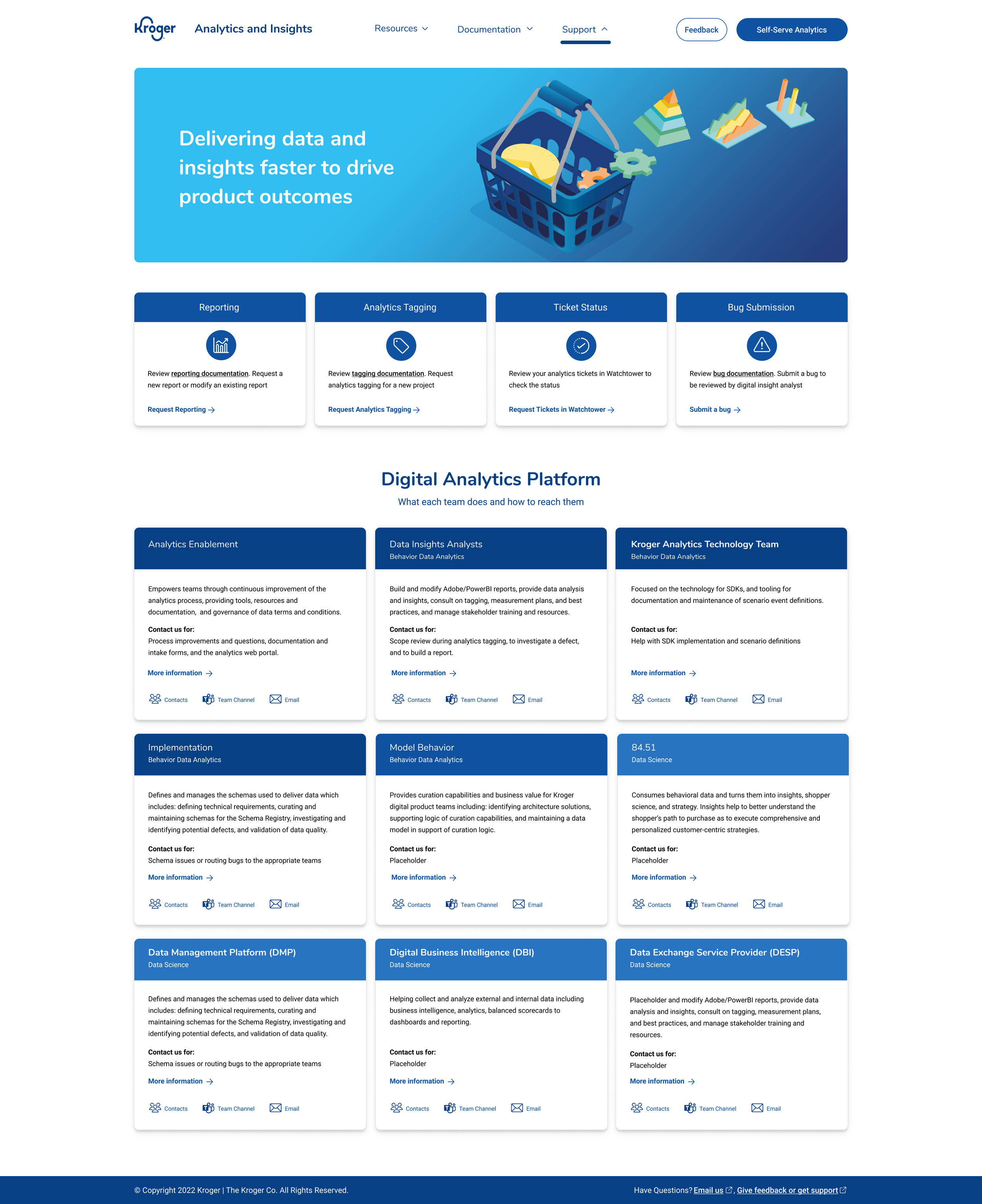
VISION
Transform how customers discover and engage with Data & Analytics Platforms teams, services, and tools. By providing a seamless and intuitive experience, we empower customers to quickly find the right DAAP capability or team to address their need, and increasingly self-serve, while setting standardization and best practices for customer-facing documentation across DAAP teams
Landing Page Refresh Iterations
WHY
Iterate on the interface design based on analytics tools & services used most based off of card sorting
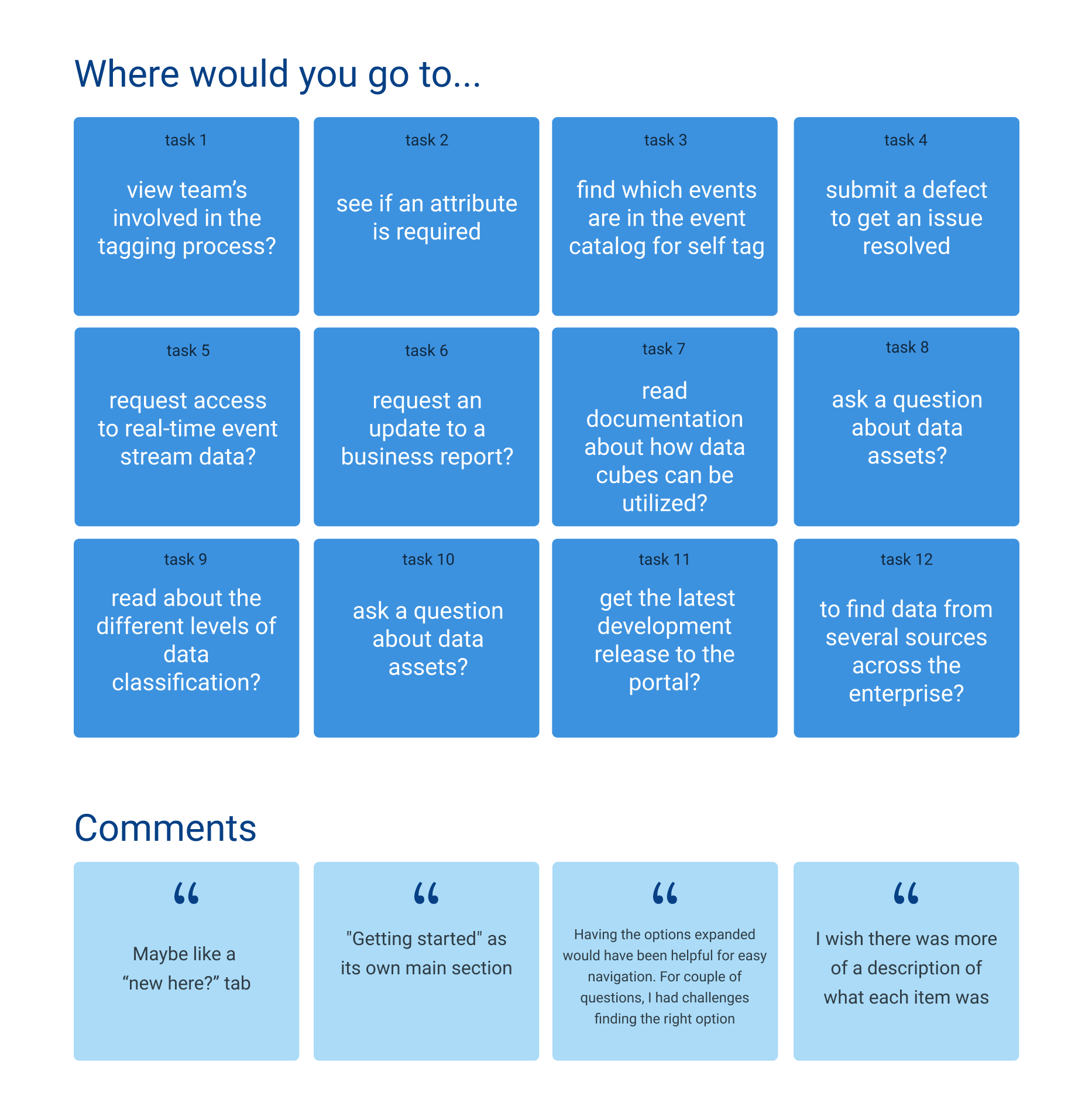
Tree Test
Mega-Menu creation with expanded teams
WHY
Test the main navigation categories to see if we were headed in the right direction
HOW
17 internal participants
Unmoderated Userzoom Tree Test (12 tasks on the right)
When asked to complete a task, users had to click on the correct link
Emailed to participates, posted in several analytics team chats, mentioned in demo meetings
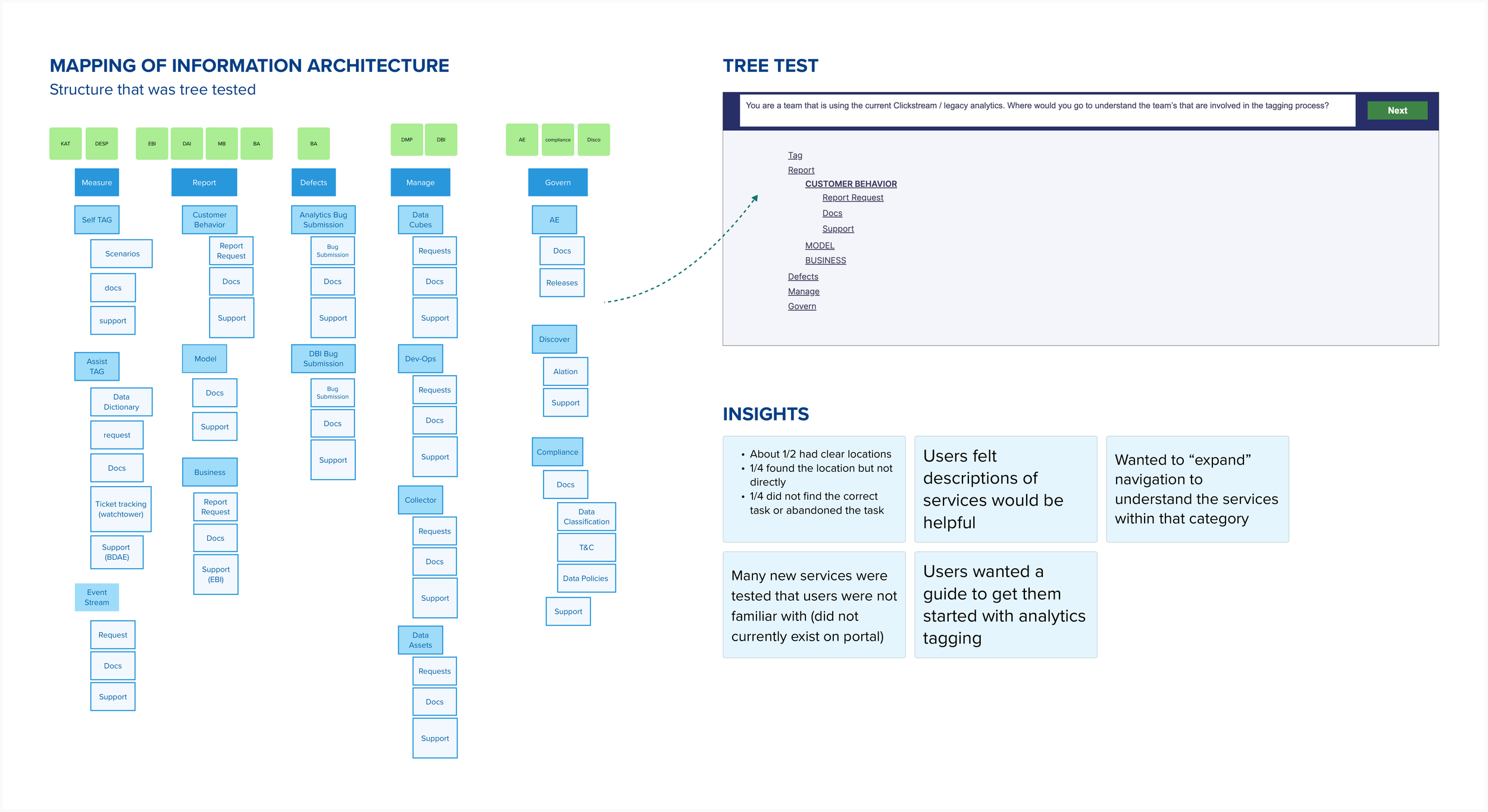
IMPACT
Added one line descriptions for better findability for highly technical services
Menu expands on hover; quickly giving a full view of services
Added a “Getting Started” flow on the landing page
Revised Navigation Informed by Tree Test
WHAT
Flat navigation with 3 levels (Main / Sub / Links)
Background highlight & bold text on hover
Icons & descriptions for accessibility & findability
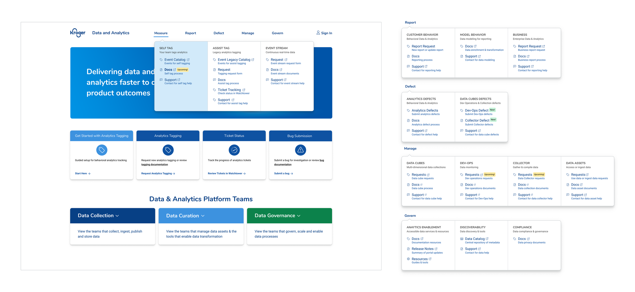
Mega-Menu navigation- all 5 menus
Five task descriptions + 1 post question to ask about their experience
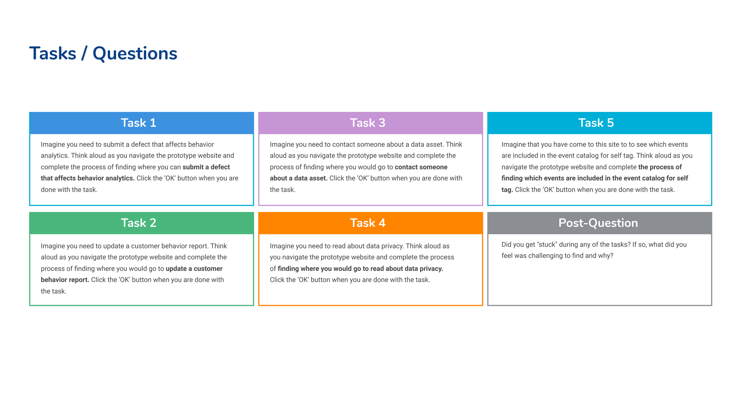
Advanced Usability Study (Navigation)
WHY
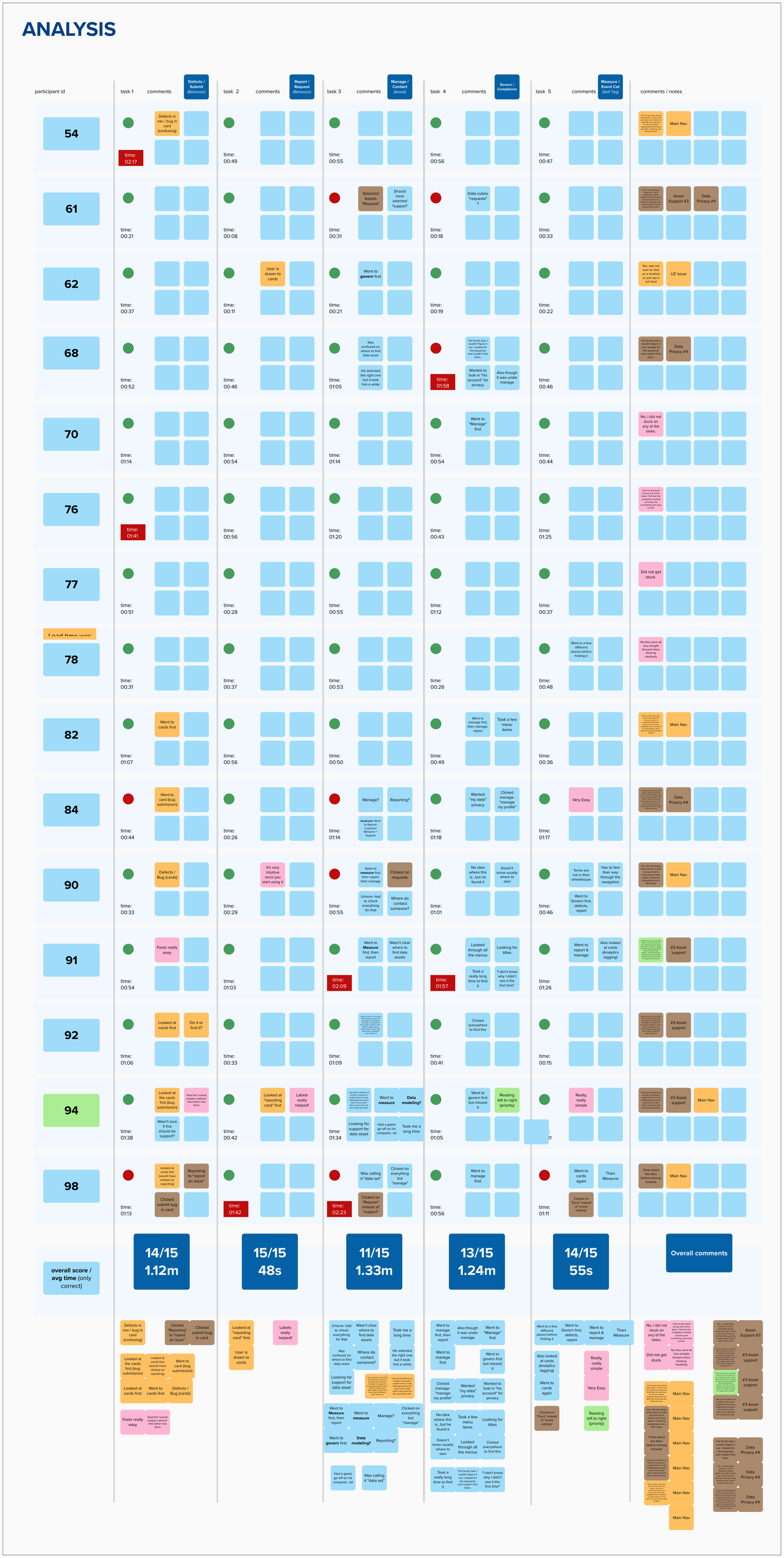
Showing the analysis of the 15 participants & their results
Test the navigation: understand both strengths & areas of improvement
HOW
17 internal participants
Unmoderated Userzoom Tree Test (12 tasks)
When asked to complete a task, users had to click on the correct link
Users shared the screen when completing the tasks and were asked to talk out loud about the things that were beneficial or challenging
Emailed to participates, posted in several analytics team chats, mentioned in demo meetings
CHALLENGE:
Internal feedback and participation in studies has been consistently low and has been a challenge for the team. In order to overcome this challenge, we used external participants (consumer segment in Userzoom) to test the usability of the navigation. While this approach has both pros and cons, the insights and feedback we received was valuable and led to usability & findability improvements.
Insights from Usability Test
Use left and right arrows to see all 5 insights


OVERALL RESULTS

NEXT STEPS
Rename defects to bugs
Reorganize information to put the most important & widely used services to the left for each menu
Simplify support
Consider new category names for “manage” & “govern”
Continue to iterate based on customer needs & expansion of DAAP
Customization
Simplifying the landing page for easy access to most used tools
HOW
Customization form allows users to customize their landing page
'My data tools' on landing page shows the 4 most used tools & services
WHY
Customization to improve findability & efficiency


Responsiveness
Establishing a hamburger menu & side panel navigation for tablet & mobile
HOW
Two concepts were created for the tablet & mobile hamburger menu and each of them have their pros & cons. Concept 1 uses progressive disclosure to show one level of navigation at a time which makes the experience less overwhelming to the user but the user must go back to select a different top level menu item. Concept 2 shows all 3 levels of the navigation at one time– allowing the user to select another option without having to move backwards, but all the information shown at one time can be overwhelming.
WHY
The portal is focused on web; however, the portal needs to be responsive so that the window can be minimized to view screens side-by-side mainly for documentation purposes

Results
Ultimately, concept 1 using progressive disclosure was selected because it limited the options that were visible & made it less overwhelming for the user based on a simple internal concept test