DORA app
(Designated Outdoor Refreshment Area)
Gives patrons and community members guidance on navigating the route, crowdsourced information about locations and events, and features passport incentives along the DORA route in Wyoming, OH.
Client: The City of Wyoming
User Experience: tasks flows, information architecture, benchmarking, personas, wire framing, user testing
Design Requirements
Event listing/search for users
DORA passport incentives
Individual screen for each business/event area
Interactive location-based map that highlights filters on type of location
Street-view navigation based on location of the user
DORA boundary indicator with warning system
The Challenge
The need to bring in non-residents and keep residents in Wyoming for entertainment/events
Lack of incentive to visit multiple businesses along the DORA route
Patrons might not know the boundaries of the DORA or the DORA locations along the route
Community event promotions (social media, websites) are not centralized and can be missed
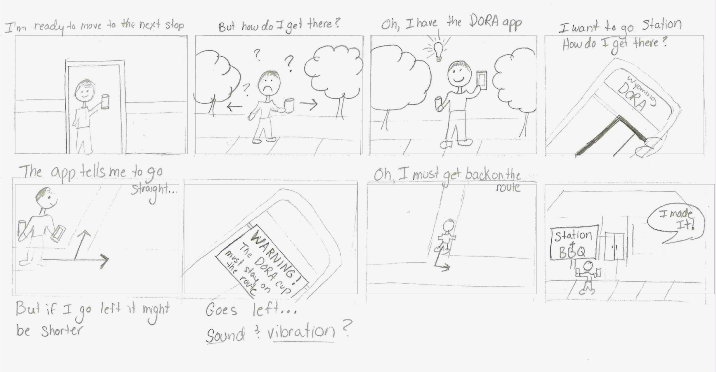
Scenarios and Initial Sketches
Task Flows
Information Architecture
Target Audience
People looking for good food, drinks, and entertainment in Wyoming. This includes Wyoming residents and non-residents. Business owners and community leaders also play a role in creating and planning special events to bring people to locations along the DORA route.


Wireframes: Tasks 1 to 3
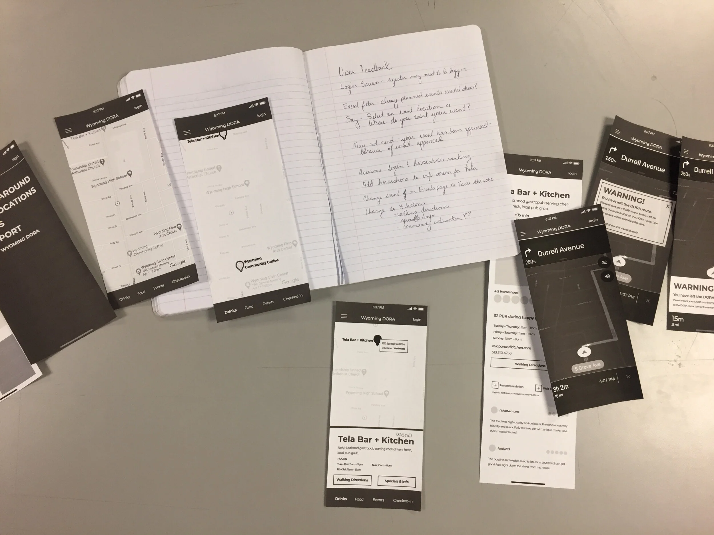
Paper Prototyping Feedback
1. Login Screen- register may need to be bigger
2. Assume login & horseshoe ranking to cut down on the number of wireframes
3. Event filter: Would already planned events show here?
4. Possibly say, “Select an event location,” or “Where do you want your event?”
5. Remove approval confirmation wireframe (this will be received by email)
6. Change order of screens for ‘Event Creation’ so that it makes sense to preview, edit if needed, and then submit
Both users liked the emergency pop-up
and the more neutral ‘You have arrived’ screen
I used the established City of Wyoming branding for the app including colors, fonts, branding, and a style aesthetic (casual, welcoming, and friendly).
Initial style frames
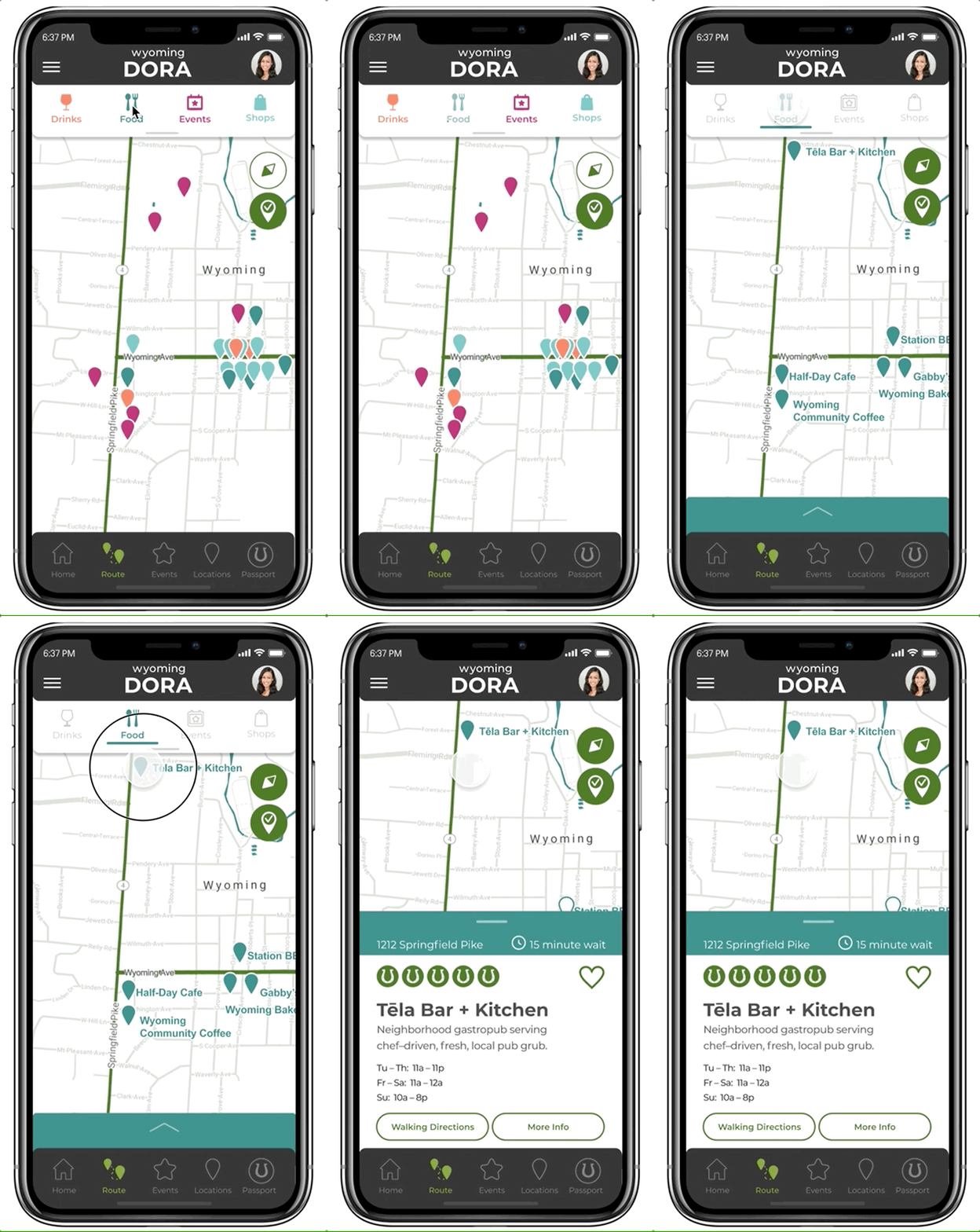
Map of DORA locations, with filter by type and location information
In addition to the previous simple concept, I wanted to try a theme that was a little more fun.
Wyoming City Schools’ mascot is the Cowboys, so I felt that an old western saloon feel would be appropriate. Prohibition and speakeasy imagery fits well with this style and provides irony since this app is all about alcohol. The aesthetic is a dark and dusty feel with vintage–style lettering and tongue-in-cheek language used in old western movies.
Style frames using the saloon concept for inspiration.
The simple Wyoming Branded theme was the winner because the brand was established and the city wanted to distance the city brand from Wyoming City Schools’ brand.
Initial Style Guide
Wyoming Community Leaders Feedback via Zoom
The city preferred Wyoming DORA so the name was changed to reflect that.
They wanted to add shopping in addition to drinks / restaurants / events, which led to a change in the bottom navigation (addition of shop filter).
I also added additional buttons in the top right corner to include all locations on the map (no filters applied, this screen would show prior to the user selecting a filter) and a checked-in location filter showing locations that the user has checked into.
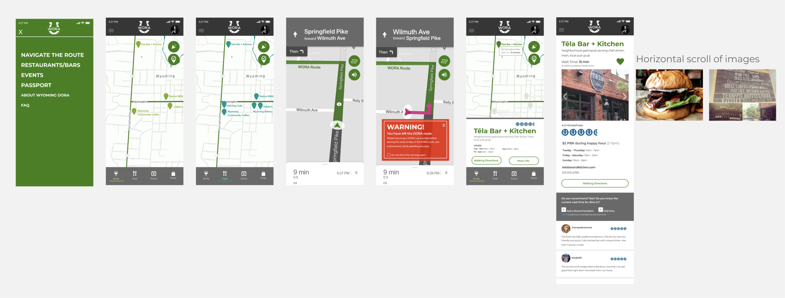
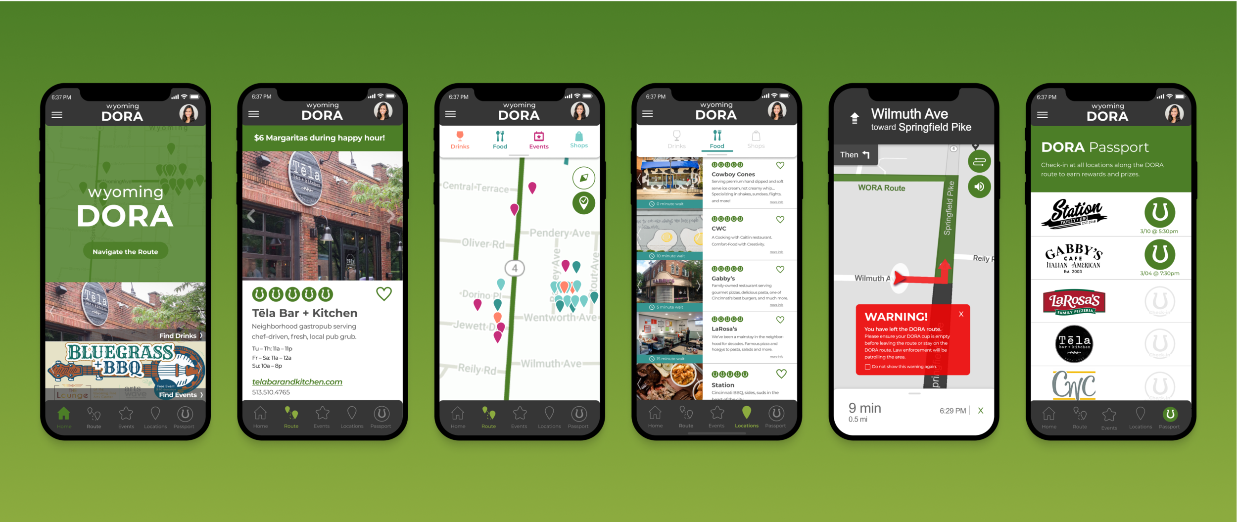
A few of the final style frames across the app:
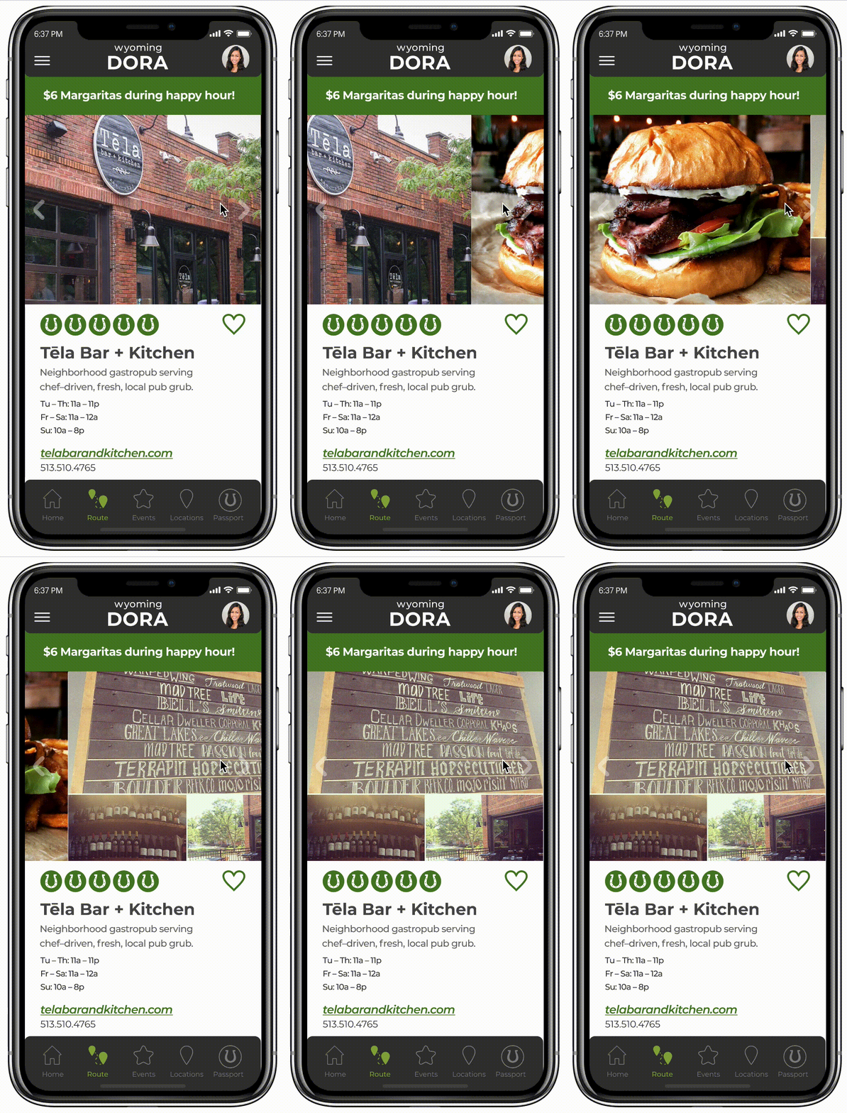
Restaurant Horizontal Scroll
Final Stylized Frames: Task 1
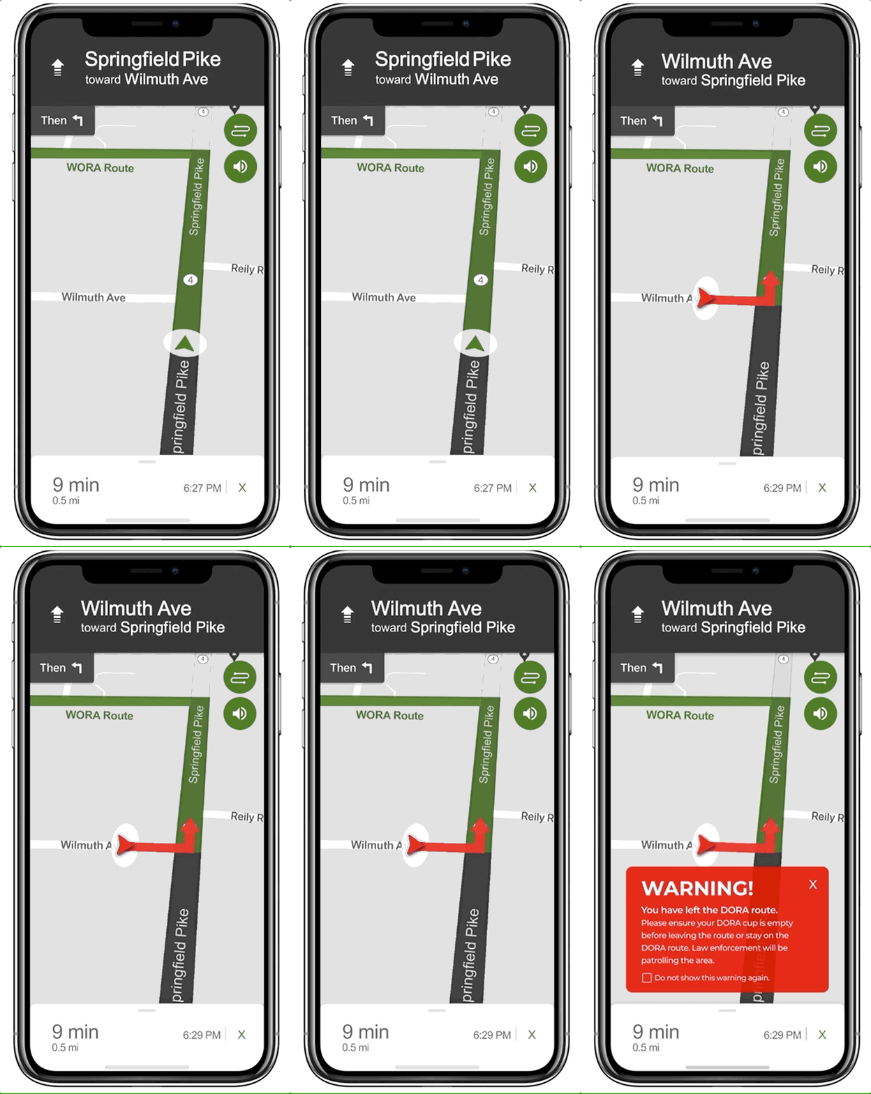
DORA route warning. (Pop-up time shortened due to file size on portfolio page.)


