
Communicating Data Visually
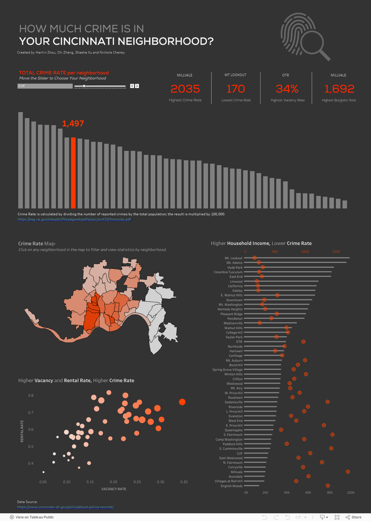
Crime Data in Cincinnati by neighborhood
Data visualization of Cincinnati crime data with filters and parameters
Tableau, Adobe Illustrator
Independent project for data visualization class
Challenge
To showcase an interactive, filtering data visualization using Tableau and Cincinnati crime data (2019)
Results
The project was a success. Coding was used to manipulate the data using filters and parameters, so that users could select neighborhoods and filter the data.
If the data visualization does not show up below, please click here to view/interact with the visualization on Tableau Public.
Main Tasks
Use the slider or click on an orange bar to see the number of crimes in a specific area of Cincinnati
Click on an area in the map to filter the data for the vacancy rate and income compared to crime rate
View data
Click on the another area to view data details for another area
COVID-19 Cases and Deaths disproportionately affect people of color in most states
An interactive data visualization in Figma that tracks data to inform the public. I chose the disparities of COVID-19 because it is a very recent example of disparities between racial groups, and the data visualizations that existed were confusing, overwhelming, and lacked the visual communication to motivate people to reduce the spread of cases.
Interactive data visualization with filters
Figma
Independent project
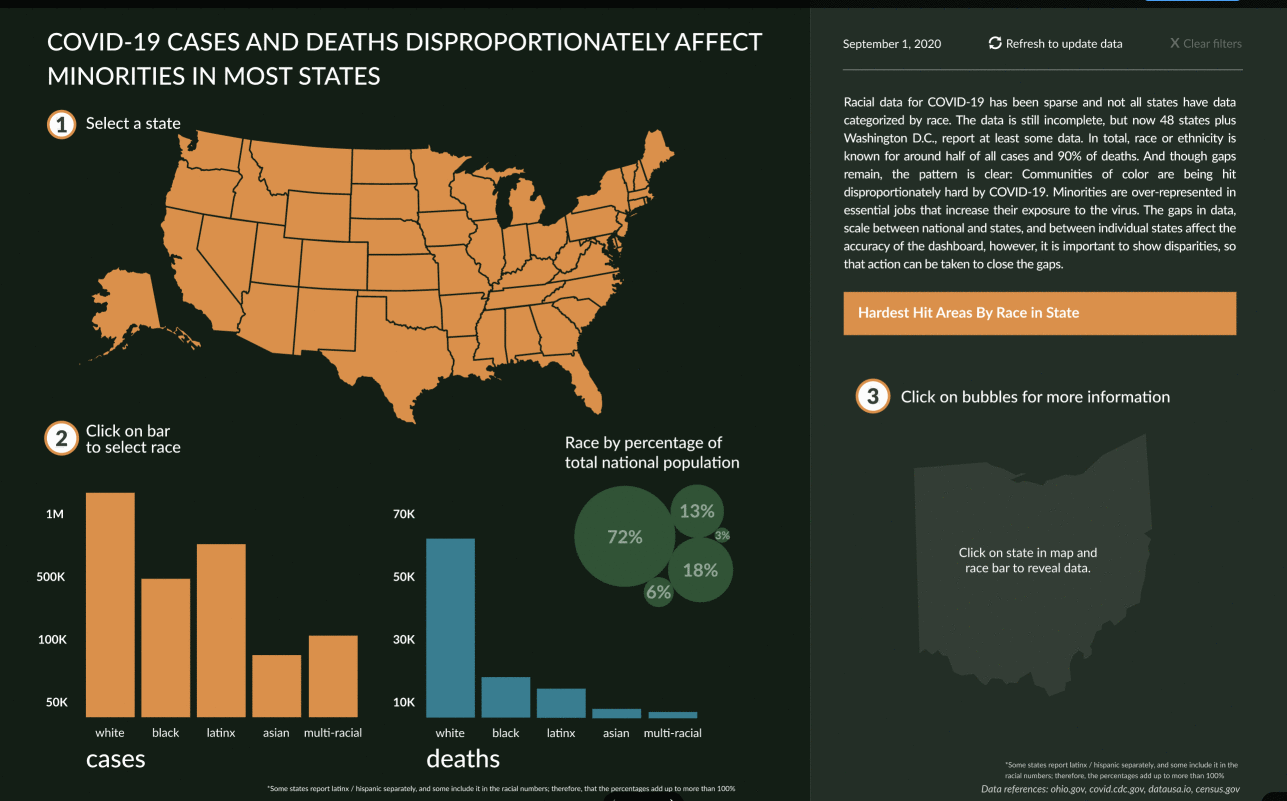
Covid-19 Visualization Demo
Challenges / Limitations
Not all states breakdown COVID cases/death by race and many websites reported gaps in their data
Each state can be vastly different in the numbers they are reporting, therefore, a standard x/y scale doesn't really work
For the same reasons, going from a national level to a state level is vastly different in terms of numbers, so the same scale doesn't work there either
The comparison of cases / deaths / percentage of population also vary dramatically in scale so it is hard to compare the numbers
The percentages of population add up to more than 100% because "Latinx/Hispanic" is an ethnicity, therefore, you can be Latinx and black or Latinx and multi-racial. Latinx can be represented in more than one group
Main Tasks
Hover over the top portion of ‘Ohio’ to see case numbers
Click on the state of ‘Ohio’ to filter by state
Click on bar representing “Black” cases
Hover over total percentage of population circles to get details by race
Click on a ‘bubble’ to get cases/deaths of Black people within a hotspot
Clear Filter